I used to perform* magic tricks as a kid and I’ve always been in awe of the pros to this day. So for this month’s Iron Quest theme – Myths, Mystery & Magic – I had no trouble deciding which of the three elements I’d be going for.
Finding data
I started by looking for data about famous or professional magicians or famous magic shows, which, not surprisingly, was quite tricky (haha!) to find. But this ended up being a good thing because it meant that it was an opportunity for me to try out something that has been on my learning-list for a long time: web scraping.
Alteryx makes web scraping incredibly easy. I didn’t get too deep into it – no doubt it’s something that grows arms and legs as you dive in – but I got the basics working thanks to this post by Manuela Marolla from the Data School in London. I was able to pick up some decent “Top 10 Magicians of All-Time” types of data from a few different web pages and parse it out into a usable format. But for creating the visualization about magic that I had in mind, the data felt kind of….. meh.
So I needed to narrow down the topic, which brought me to playing cards – since my preferred magic trick has always been the card tricks. Card trick data wasn’t exactly easy to find, either. But the deck itself… why not use it as a data set?
My approach
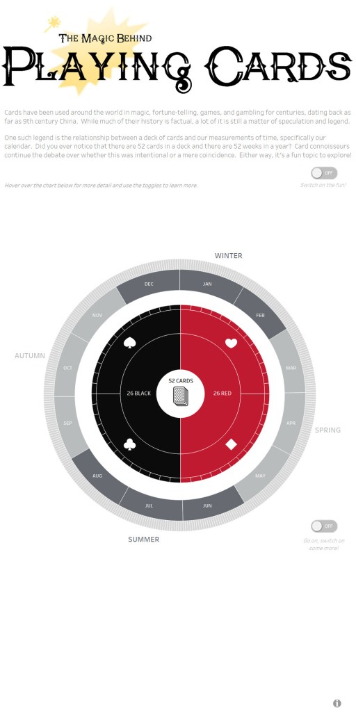
There’s so much going on with a deck of cards beyond the similarities with our calendar – theories about what the suits represent, what or who specific cards represent, the list goes on. But for this viz I decided to stick to the calendar similarities since there’s plenty there to work with and at the same time not be TMI.
I recycled an idea behind some diagrams that I had created in the past for work using Visio and Power Point that represent the calendar in a circular way (think annual programs, activities, or deadlines – that sort of thing). Turns out I was actually creating a “sunburst” chart to illustrate these timelines, but I didn’t realize it at the time.
A sunburst chart is a ringed/circular one that requires that the data is hierarchical in nature – in this case:
year > season > month > week > etc.
and for a deck of cards, you’ve got
colors > suits > card values
While it may look complicated initially, I would suggest that a sunburst is pretty straightforward to do in Tableau if you’ve got the right guidance (thank you Toan Hoang and Ken Flerlage). There’s still quite a bit of trial and error to get it looking the way you want, but it all helps you get a better understanding of what Tableau is doing in the background.
For this viz I used two separate sunbursts (one for calendar and one for cards) and floated one on top of the other:

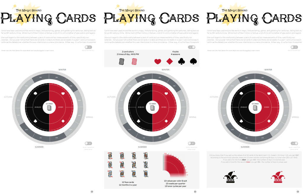
With a little transparent worksheet magic, it looks like they are one. And what should be in the tool tips for the card chart? An image of the relevant card, of course! Luckily, a little online hunting paid off and I managed to find a zip file with all the images on Kaggle in one place. Thank you fellow Kaggler James McGuigan! I was not looking forward to downloading 52 images so this saved me a lot of hassle 🙂 Pablo Gomez has a blog post on using viz-in-tool-tip, specifically how to update its filter, which I needed in this scenario with the card images.
How to annotate the context?
I was debating the best way to show the relevant context – should I put it around the chart in a static way, or see it all via tool tips, or use an action of some kind to allow the user to switch the details on or off? This info is of course key to the whole visualization and working with a circular chart type presents different layout challenges compared to other chart types. It seemed awkward to have the annotations static since there are too many things to point to in the chart and it felt too busy that way; I really liked the simplicity of seeing the rings on their own when you open the viz. This meant that figuring out how to use show/hide containers would be the next logical step – and thankfully, Lindsay Betzendahl has a detailed blog post for it.
Show/hide containers are awesome – they allow you free up space on your dashboard that might normally be taken up by controls, legends, or extra detail that doesn’t need such a prominent spot. I haven’t used them much before this viz, but now that I’ve had some pretty solid practice with them, I will definitely be using them more from here on.
Feedback and iteration
I reached out to two data rock stars in the Tableau community for their thoughts on my first non-pie circular visualization – Kevin Flerlage (thank you for the toggle buttons!) and Kate Brown. It’s easy to get so wrapped up in your own work that you can’t see it as objectively after awhile, so I was grateful for their time and input. Here was the final product:
And here is the viz with the annotations shown:
My key learning for The Magic Behind Playing Cards visualization:
- Basic web scraping using Alteryx
- Creating a sunburst chart using Tableau
- Floating transparent worksheets on top of each other
- Using viz in tool tip to show images and apply a filter to it
- Using show/hide containers for annotation
Thanks for reading.
*mostly in the mirror or at the occasional family gathering!
