
Image by Free-Photos from Pixabay
I thought it was time to check in on the blog-front, so here I am!
The first quarter of 2021 offered me two new opportunities: writing about and teaching a few aspects of data analytics.
I was asked by Mary Aviles at Nightingale, the journal of the Data Visualization Society, if I would be interested in turning my recent talk at the Tableau Fringe Festival into an article. My first thought was that there’s just too much packed in there… the article would be way too long! But fast forward several weeks, iterations, and trims later, my article on data scaffolding using Alteryx and Tableau was published in February. It’s a detailed how-to document that I hope will be a resource for anyone who might need to apply the technique to their own work and save them some time and frustration. Putting the presentation into words on ‘paper’ (Microsoft Word, that is…) called for a different type of brain power! Thanks Mary for for your superb feedback throughout the process.
In March, I led two workshops for groups of high school girls attending the WOW! That’s Engineering Conference presented by San Jose State University’s Society of Women Engineers (SJSU SWE). My workshop was an introduction to data visualization, all held virtually via Gatherly, and was a great opportunity to hopefully have inspired some of the next generation of women going into STEM subjects in college.
No doubt they will encounter times when they need to communicate effectively using data. And no harm to introduce them to a few key areas of data visualization early on their academic and professional journeys, such as: pre-attentive attributes, delivering a clear message, knowing what chart-clutter is, and a crash course on Tableau Public.
Here’s a screen shot from the committee while I was taking the ladies through some examples of good data visualization. On-screen is Steve Shoemaker’s No More Movie Theaters – this viz really seemed to click with my audience as we have all felt the hit on not being able to do things (like go to the movies!) in the past year. The viz seemed to make a lot of sense to them and hopefully register how powerful data visualization can be.
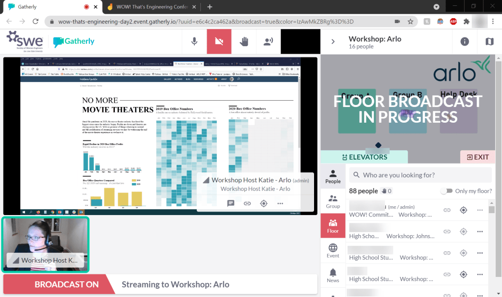
Showing Steven Shoemaker’s “No More Movie Theaters” to an eager group
of young ladies over Gatherly – a great example of good data viz
Key learning:
- Writing about something is entirely different to speaking about or presenting on it – while I was aware of this already, this writing exercise was a great reminder
- Teaching something to others, particularly to a demographic you may not be used to presenting professionally to (in this case, teenagers), forces you to re-think and adapt the way you convey the information
I’m looking forward to whatever opportunities Q2 may bring.
Thanks for reading.
